
I’m going over my notes and I see that my previous design that I shared with you is primarily interested in capturing the color scheme and the overall tie as an exclamation point in a caution sign capacity. But it’s important to think about real world applications like this picture suggestion from one of our patrons, who mentioned that it also imitates a Pearl Jam album cover. All that is okay though, since we are still trying to dissect and analyze how our warning sign fits into everything else: Band brand, artistic statement, current trends, future perception, and many other aspects. Where do you see a sign like ours taking effect or having an impact?
New Merch
-
 YTG "Information" Matte Black Magic Mug
$15.00
YTG "Information" Matte Black Magic Mug
$15.00
-
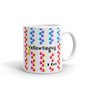 "I Cry" Album Art Mug
Price range: $12.00 through $15.00
"I Cry" Album Art Mug
Price range: $12.00 through $15.00
-
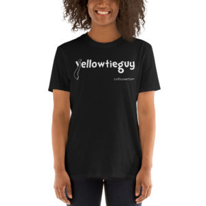 "Information" Album Art Unisex T-Shirt
Price range: $15.00 through $18.00
"Information" Album Art Unisex T-Shirt
Price range: $15.00 through $18.00